
History of International Design Day
World Graphics Day was established by the Council of International Graphic Design Associations on April 27, 1963. Graphics Day World, also known as World Graphic Design Day, is an opportunity to recognize media design and its role in the world. This year we celebrate the 60th anniversary.
This initiative celebrates how design adds beauty and meaning to our everyday lives, encompassing aesthetics, form, and function. It also promotes various areas of design, including visual communication, graphic design, awareness, promotion, management, and training worldwide.
World Design Day aims to inspire and raise awareness of the value of design, highlighting its ability to impact the world. History provides numerous examples of how great design surrounds us in our immediate environments, from simple objects like stairs and ground tiles to the packaging of our favorite items.

This year’s theme
Graphic design, the art of finding solutions to visual problems, gives us many opportunities to give graphic solutions. This years theme is “Peace.Love.Design!”. Taking us back to what we recognize as the beginning of graphic solutions to social problems. Simple type on a piece of paper representing a social opinion – from olden day to this day we use posters and banners to show what we stand for.
Inspired by the activism of the sixties, we are encouraged to explore issues of environmentalism, social equity, collective movements and radical change. Members of the International Council of Design and other design organizations were invited to lead events, in-person or digital, covering topics related to the theme.

Environmentalism in Graphic design
Environmental graphic design, or experiential graphic design as it is called more often, has absolutely nothing to do with Mother Nature – although the name would lead you to believe that. Instead, EGD is concerned with wayfinding – all the ways human beings navigate through space to get from one place to another – identity and brand communication, and information flow and design. But most of all, it is concerned with shaping a real idea of a space physical space. It is a multidisciplinary profession that gathers industrial design, architecture, graphic design, and landscape architecture – among other things.
It developed from a need in our society for buildings and areas to be reinvented, re-conceptualized, and re-purposed instead of only being stripped down when they no longer served their purpose. It also stems from a need to reduce our environment into easily-digestible chunks that we can navigate safely and confidently. With the emergence of new technologies, Environmentalism in Graphic design became a necessity that allows us to navigate life more efficiently, and that is why every single freelancer in the fields of architecture, graphic design, and related professions needs to be well-versed in what it is and what purpose does it serve.
Social equity in Graphic design
Fonts for dyslexia
The world has roughly 7.8 billion people living it in, where 780 million of them are dyslexic. This total includes people both diagnosed, undiagnosed, and misdiagnosed. It is estimated that 1 out of 10 people have dyslexia. The best fonts for dyslexia share some characteristics such as being:
Sans Serif – This term literally means “without serif.” Serifs are those little projections at the ends of letters some fonts use to make them look a little fancier.
Non-Italic, Non-Oblique – Oblique fonts are a slanted version of a font, while italic fonts have a slanted and more stylized appearance. Either way, this style significantly reduces readability, so stick to upright fonts, also known as roman style.
Monospace – A monospaced font, also called a fixed-pitch, fixed-width, or non-proportional font, is a font whose letters and characters each occupy the same amount of horizontal space.

Some fonts suitable for people with dyslexia are:
Adys – a free font created by the dyslexic designer Kristina Kostova. You can read more about the project ang get the font here: adysfont.com
Dyslexie – A Font designed by Christian Boer who also has dyslexia. It features long stems, unique shapes, and heavy, bolder bottoms. Each of these features is meant to give each letter its own qualities and make each one easily distinguishable. Can be found at dyslexiefont.com
OpenDyslexic – is another free font designed specifically for those with dyslexia, with heavy bottoms and thin tops that are meant to prevent letter flipping. Letters are well spaced, and each letter has a unique style. OpenDyslexic is open-sourced and can be found at opendyslexic.org.
Other very commonly used fonts are: Arial, Helvetica, Comic Sans, Verdana, Century Gothic, Tahoma, Calibri, Open Sans.
Special tools for better contrast and color blind pallets
Adobe Color
One of the best tools for checking if your design is suitable for people with color blindness is Adobe Color. It features a new Accessibility Tools section, which includes the Contrast Checker and Color Blind Safe tools.

Contrast Checker
This tool lets you bring in your text and background colors to check their Contrast Ratio. Just scroll down to the Review section, and there you can see how your color combo performs in three types of tests: Regular Text, Large Text, and Graphic Components. The Small Text one is super important since it affects how easily your design can be read.
When you’re designing, keep in mind different factors, like if your users have any disabilities or color blindness, and the kind of display they’re using. But don’t let these things hold you back from making your design accessible to everyone. It’s all about being making sure everyone can enjoy your work.
Color Blind Safe
The Color Blind Safe tool, another part of the Accessibility Features panel, allows you to check if your chosen colors meet Color Blind Safe guidelines. It identifies any possible color conflicts and suggests adjustments on the color wheel to make your colors more distinct. The tool also features a Color Blind Simulator showcasing the three most common types of Color Blindness:
Deuteranopia
Inability to distinguish red and green pigments, primarily caused by recessive genes in the X chromosome. Deuteranomaly, a similar condition, affects about 6% of men and reduces sensitivity to green light, making it difficult to differentiate between shades of red and green.
Protanopia
Reduced sensitivity to red light, leading to difficulties in distinguishing shades of red and green.
Tritanopia
Tritanopia is A rare form of “blue-yellow” color blindness, affecting both males and females equally. While it doesn’t hinder the perception of blue and yellow, it can cause confusion between colors containing blue or yellow, such as green-blue, yellow-pink, and purple-red.
Though tritanopia confuses color perception, and colors may seem less bright, it does not affect the clarity or sharpness of your vision.
Understanding these types of color blindness is crucial for designers to create more inclusive and accessible designs that cater to a broader audience, ensuring everyone can appreciate and engage with their creations.
Why these tools are important
Tools like Adobe Color are important because they promote awareness about color blindness. They encourage designers to consider the experiences of people with such conditions while using their products. The goal is to ensure that everyone, regardless of whether they are color blind or not, can easily utilize our designs.
In conclusion, it is crucial for more people to be knowledgeable about color blindness and its different types. By raising awareness, we can foster understanding and empathy. It’s unreasonable to expect someone to appreciate the challenges of color blindness if they lack the necessary understanding of the condition.
Past themes of the event
In the past couple of years, we have observed that event themes have shifted towards raising awareness. The focus is on encouraging designers to be more considerate of people with disabilities or color blindness, making designs more inclusive. I appreciate this approach, as it reflects a broader trend of increased awareness and acceptance of diversity.
Personally, we don’t view differences as negative; in fact, we embrace our uniqueness. We all have distinct hobbies, interests, and ways of enjoying life. Embracing diversity enriches our world and prevents it from becoming monotonous.
2022 theme:
Suspended in Transition
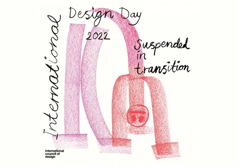
The theme of International Design Day 2022 is “Suspended in Transition,” acknowledging the uncertain phase between old and new ways. Instead of rushing forward, it encourages embracing the unknown for regeneration and growth. This theme urges designers to step out of their comfort zones, reflect on partial-knowing, and explore alternative futures. The day invites organizations to host events exploring sub-topics like design’s impact on the planet, adapting to changes, designers’ responsibilities to communities, and envisioning a better future.
2021 theme:
Design for Each and All
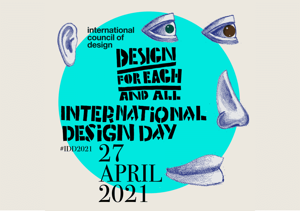
The theme of International Design Day 2021 is “Design for Each and All,” emphasizing equitable access to the designed world for all individuals. It acknowledges the diverse human family and how designers play a vital role in creating inclusive experiences. The event, previously known as World Design Day, was renamed International Design Day in 2021. The aim is to design for universal well-being, considering social, economic, environmental, and geographic factors. The theme encourages designers to question how their designs can create a more inclusive and fair world, benefiting everyone’s access to knowledge and well-being.
2020 theme:
Be Professional!
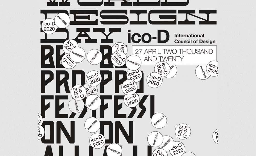
The theme for World Design Day 2020 was “Be Professional!” It encouraged designers to reflect on their role not only in creating designs but also in their broader responsibilities towards humanity, the planet, and culture. The focus was on differentiating between being a designer and a design professional, emphasizing the obligations and ethical considerations that come with being a professional in the design field. The International Council of Design recognized the need for designers to reevaluate their roles and responsibilities in the face of global challenges and the impact of their work on society, culture, and the environment.
2019 theme:
Women in Design
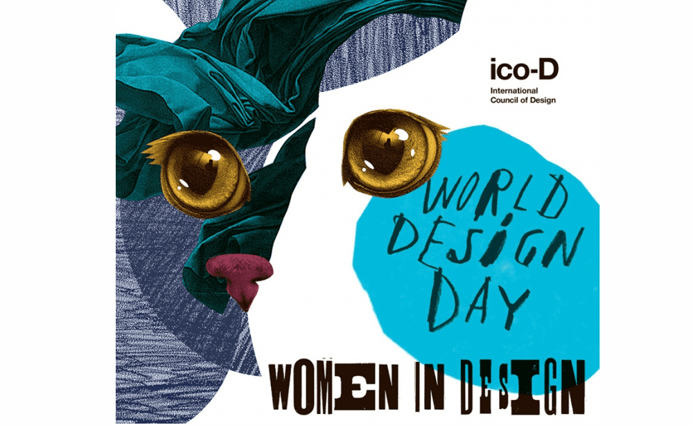
World Design Day 2019 focused on honoring women designers who create intelligent, inclusive, and sensitive designs that make a positive impact. The event aimed to challenge designers to reflect on the state of the profession and recognize the significant contributions of women designers in creating innovative solutions for health, justice, and human rights. The day included activities to celebrate and acknowledge remarkable women designers, past and present, while also addressing the historical oversight of women’s achievements in design. Additionally, partnerships with organizations like Aiap Women in Design Award sought to increase the profile of women designers and promote their work in design history.
In conclusion
We think that, the efforts to promote awareness in recent years have been super nice. This positive trend of increasing awareness is not limited to this event alone; it is evident in various other places as well, and we fully support it.