Bits’n’Bites
Brand Identity
Brand Guide
Brand Strategy
Brand Advertising Materials
UI Design – Mobile Application
Web Design
Motion Design
App Development – iOS & Android
In conceiving the Bits’n’Bites project, the inspiration is firstly to neutralise the growing sense of isolation among business professionals in the digital age, and secondly to revive the art of meaningful personal connections in the professional world.
The genesis of this idea is ignited by the observation of the reliance on digital communication tools that, whilst efficient, often lack the warmth and authenticity of face-to-face interactions. This observation led to the consideration of the potential for a platform that could facilitate the building of genuine relationships.
Bits’n’Bites typically evokes images of snacks and socialising, reminiscent of a time when people connected face-to-face. However, in the digital age, Bits’n’Bites undergoes a transition into the virtual realm, where ‘bites’ assume the meaning of bite, steering the concept towards using small fragments of information. The logo encapsulates a more technological vision, capturing both the warmth of meeting someone for coffee and a chat and the notion that the information is transmitted electronically.

The inspiration behind the app’s design stemmed from a desire to reflect the vibrant, dynamic nature of human interaction. The goal is to translate the energy and spontaneity of in-person engagements into the visual language of Bits’n’Bites.
This aspiration is manifested in the selection of bright colours, dynamic visuals, and modern design elements. The choices are aimed not just at capturing attention but at conveying the essence of lively, engaging conversations facilitated by the app.
We tried to create the feeling of walking into a room that’s both cozy and vibrant – an instant mood lifter where everything is intuitively placed.


Scan the QR Code of a person to subscribe and engage with them.

Receive / Send content according to your preference. Develop your business relationships like you are having small bites with them and get to know them better.


Keep your preferred people close by saving them as favorites and unlock exclusive rewards tailored just for you. With Bits ‘n’ Bites, every connection is rewarding.


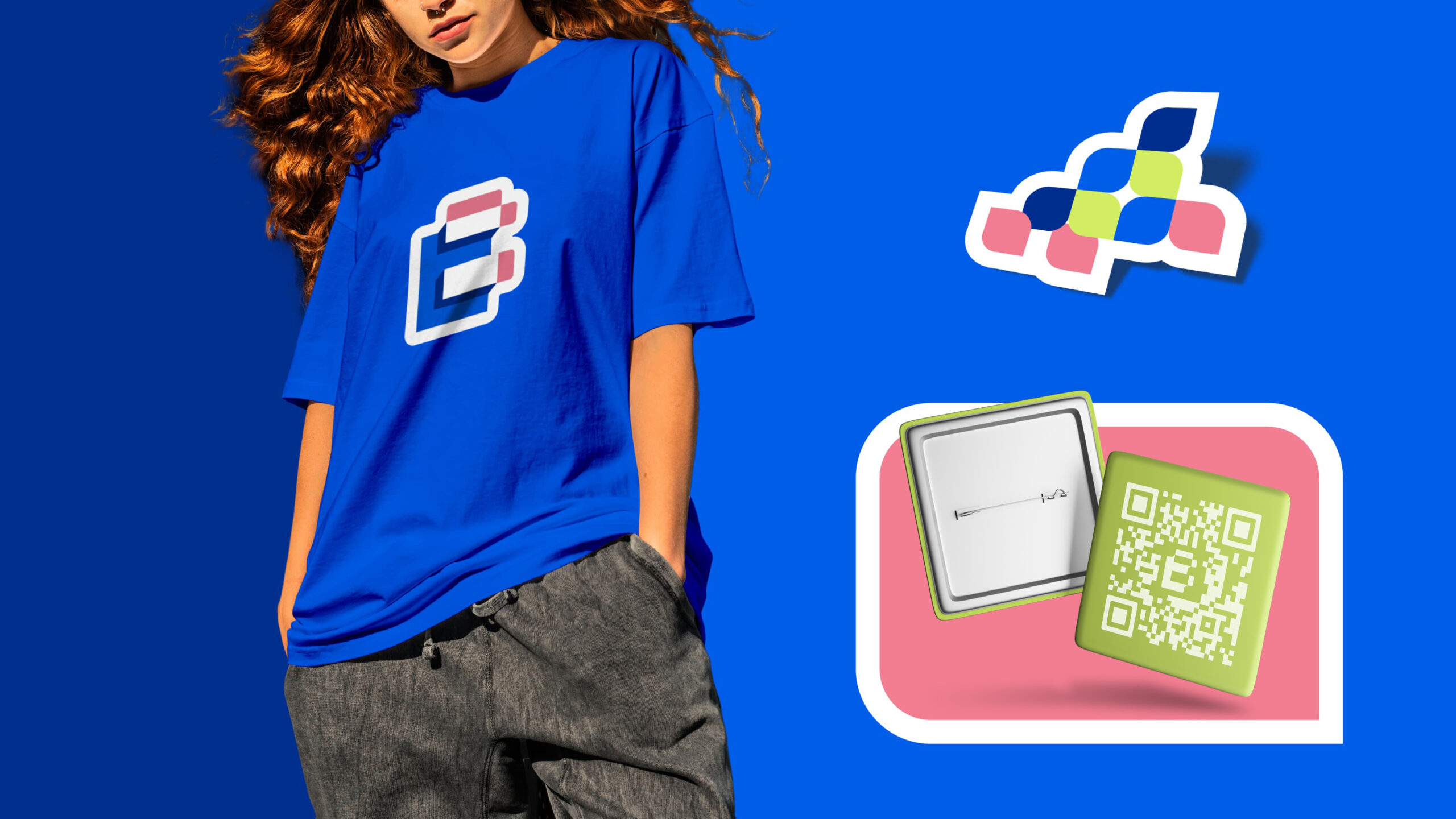


Scan the QR code and download the Application


Proud members of:
Legal:
Resources:
Services:
About:
More By Us Ltd. | All Rights Reserved © 2023
| Cookie | Duration | Description |
|---|---|---|
| cookielawinfo-checkbox-analytics | 11 months | This cookie is set by GDPR Cookie Consent plugin. The cookie is used to store the user consent for the cookies in the category "Analytics". |
| cookielawinfo-checkbox-functional | 11 months | The cookie is set by GDPR cookie consent to record the user consent for the cookies in the category "Functional". |
| cookielawinfo-checkbox-necessary | 11 months | This cookie is set by GDPR Cookie Consent plugin. The cookies is used to store the user consent for the cookies in the category "Necessary". |
| cookielawinfo-checkbox-others | 11 months | This cookie is set by GDPR Cookie Consent plugin. The cookie is used to store the user consent for the cookies in the category "Other. |
| cookielawinfo-checkbox-performance | 11 months | This cookie is set by GDPR Cookie Consent plugin. The cookie is used to store the user consent for the cookies in the category "Performance". |
| viewed_cookie_policy | 11 months | The cookie is set by the GDPR Cookie Consent plugin and is used to store whether or not user has consented to the use of cookies. It does not store any personal data. |

Has a strong passion for typography and emerging technologies, skillfully combining artistic design with the latest digital innovations. His enthusiasm for modern tech trends is actively shaping projects with unique and innovative perspectives.


With a keen eye for detail and an unmatched ability to enhance our projects, she’s the driving force behind our creative success.


Maria boasts over 25 years of expertise, spanning design, marketing, and management. Beyond guiding the business and steering the creative team, she has a knack for narrating human experiences through the hues of the Pantone color chart. When it comes to innovative and out of the box concepts, Maria is our beacon. As our chief designer and creative guru, she’s immersed in the intricate details of design and the vibrant dance of colors. She’s not just about pixels and palettes though; nature beckons to her. With a fondness for outdoor escapades, she has a particular soft spot for bees tending to her beehives with as much dedication as she does her designs. Dog tales? They pull at her heartstrings!

Vasil is a seasoned and multifunctional designer with over 15 years under the belt, masterfully shaping both digital and print media. Vasil’s heart beats for nature. An avid traveler, he’s not just skimmed the surface but deeply explored the Amazon, immersing himself in the rich cultures and wonders. His journeys give hin unique perspective, which often shines through in his work. Whether in hte studio or trekking through rainforests, Vasil lives and breaths creativity and exploration.