
Acumen Risk
Marketing and Sales Deck, Business Cards Design, Capability Statement Design
Maria Burgelova, Val Petrova, Maria Yordanova
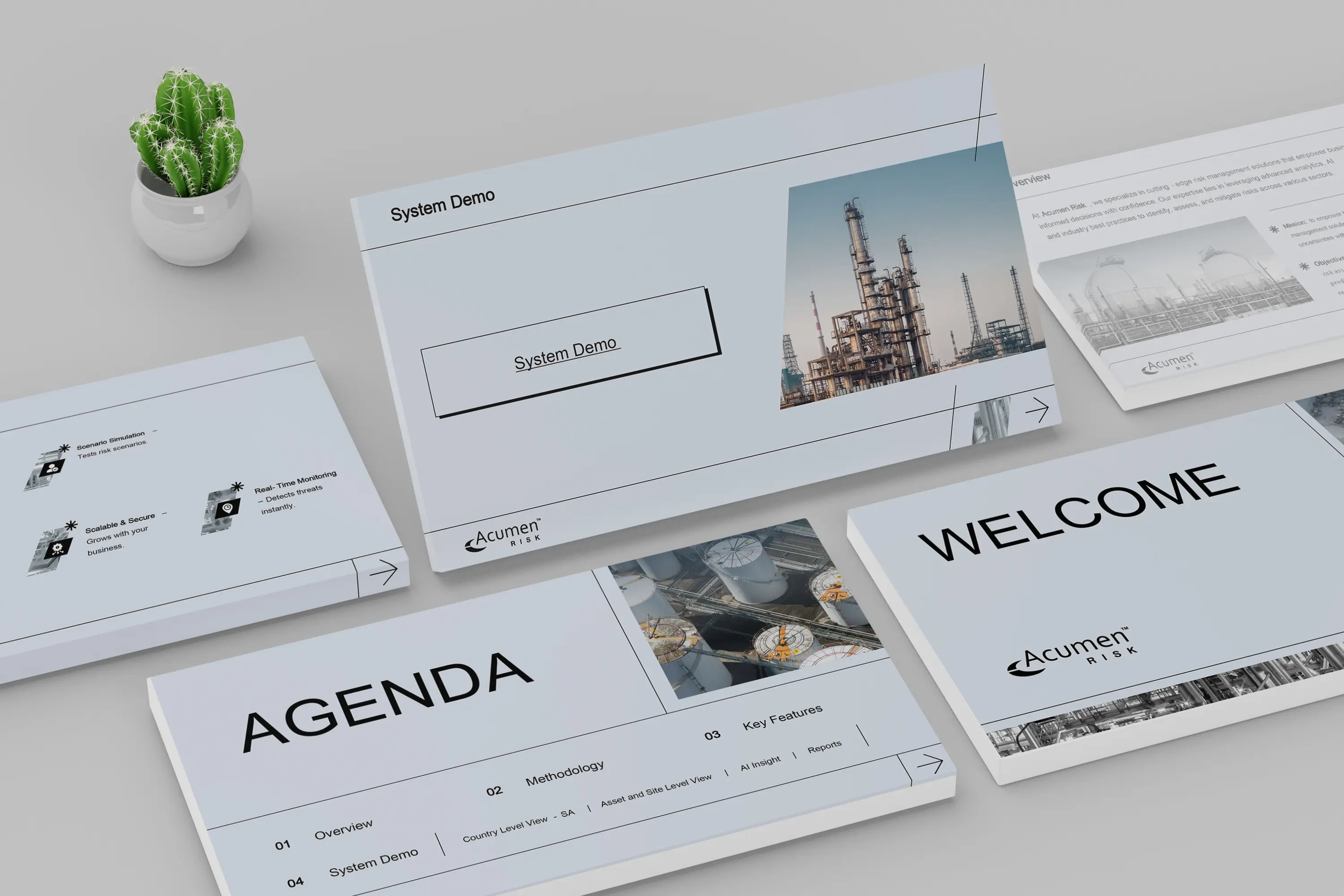
For our client Acumen Risk, we created a modern, clean presentation deck designed to communicate their insights with clarity and confidence. As a company operating at the intersection of data and decision-making, Acumen needed a visual system that reflected their precision, professionalism, and forward-thinking approach.
Our goal was to deliver a deck that felt minimal yet sophisticated, where design never got in the way of content—only elevated it. The result is a refined toolkit of slides built for pitches, internal strategy sessions, and high-level stakeholder meetings.
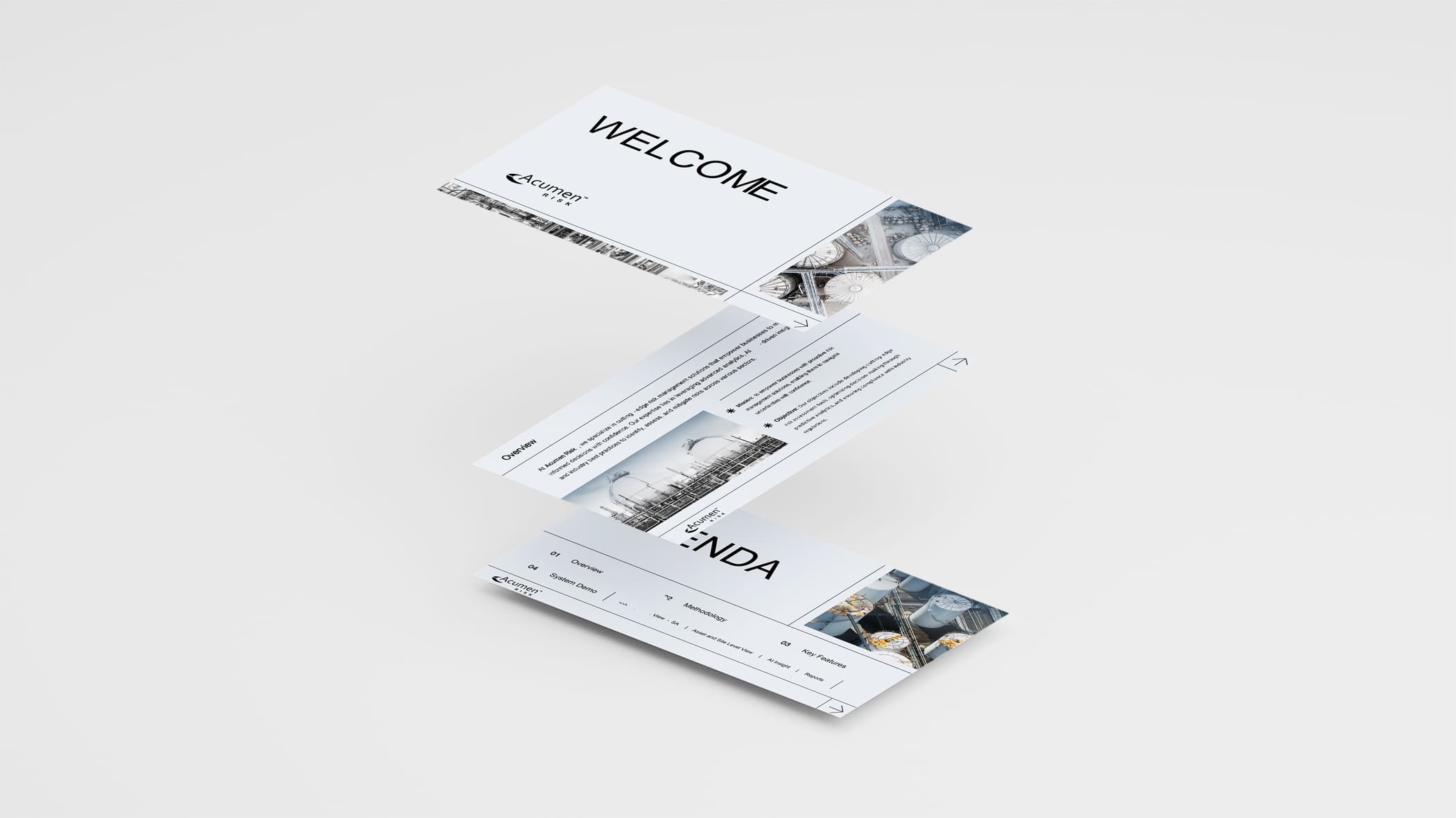
The main challenge lay in balancing a minimal visual language with high-impact storytelling. The client requested a sleek design that would resonate across industries, feel premium, and retain a cohesive tone – without overpowering the content.
On top of that, the deck needed to be extremely easy to follow and understand. Each slide had to guide the viewer effortlessly through the narrative, regardless of their familiarity with the subject matter. This required a design that was not only visually refined, but also intuitively structured, with clear visual cues and a strong sense of flow from one slide to the next.
Every slide needed to look intentional, structured, and breathable while accommodating a wide range of content types, from data visuals to full-bleed imagery.
We designed a custom deck layout system that was:
Elegant in simplicity: Using a restrained color palette of light grey, white, and ashy black, we achieved a sharp, modern feel.
Purposefully minimalist: Negative space was leveraged to give content room to breathe, allowing the message to lead.
Visually unified: Every element—from image treatment to text hierarchy—was considered for consistency and harmony.
To bring subtle warmth and depth, we incorporated grey-tinted photography—creating a visually immersive yet understated backdrop that never distracted from the core message.
Each slide was modular, allowing the client’s internal team to easily adapt and reuse the template while preserving the integrity of the design.
To complement the minimalist aesthetic, we developed a custom set of line-based icons, designed with precision and simplicity in mind. Each icon mirrored the angular design language of the deck, with subtle slanted accents that nodded to the overarching visual theme.
All icons featured consistent stroke weights and were rendered in ashy black or muted greys, keeping them aligned with the color palette and maintaining balance with text and imagery. Used intentionally and sparingly, icons helped reinforce key messages while adding visual clarity without distraction.

Typography played a central role in reinforcing clarity and tone. We selected a clean sans-serif typeface with refined weights to create a strong, legible hierarchy.
Headlines were bold and confident.
Body copy was clean and spacious.
Captions and annotations were subtle, using lighter greys to indicate secondary information.
This approach gave the content a structured rhythm while keeping every line readable at a glance.

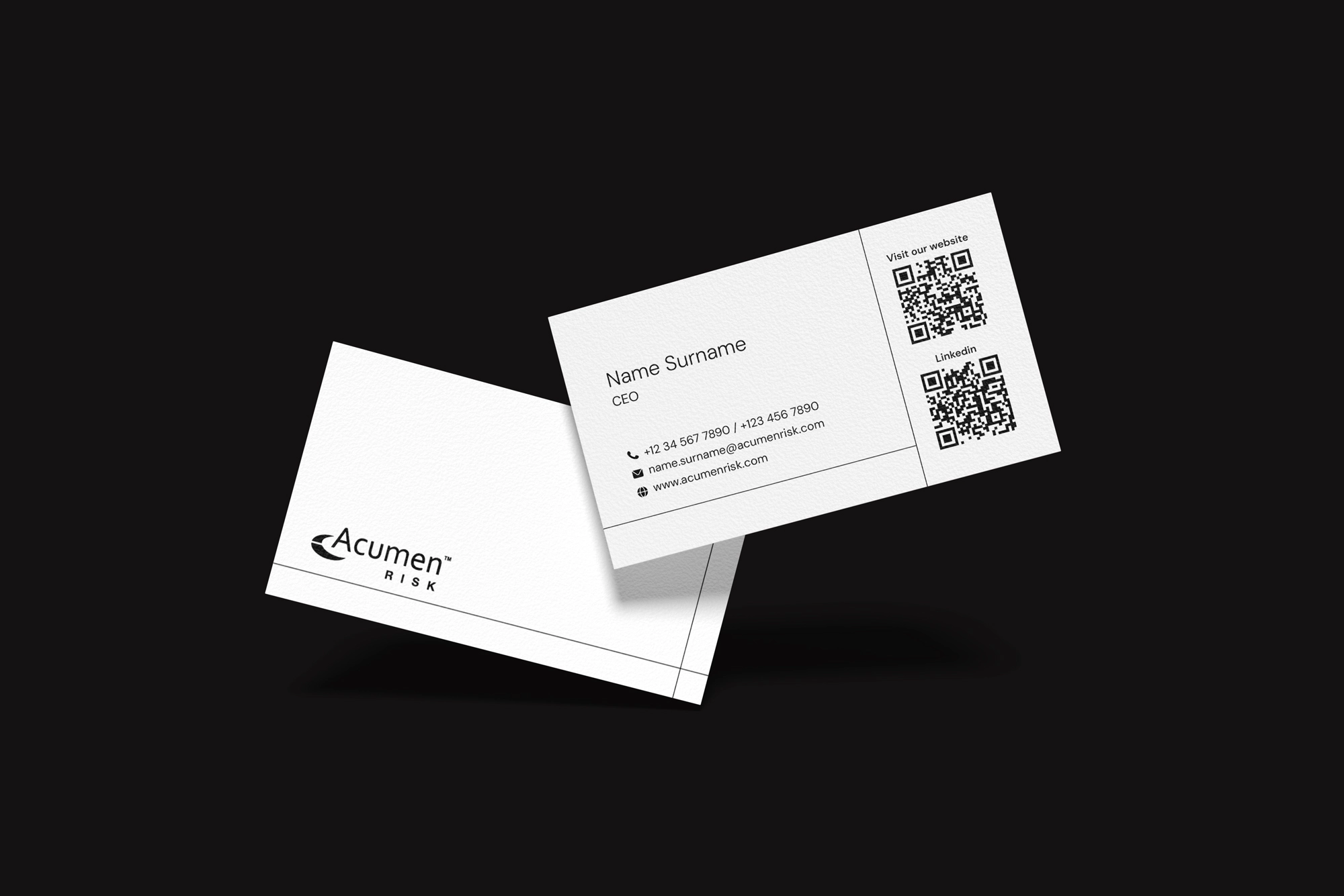
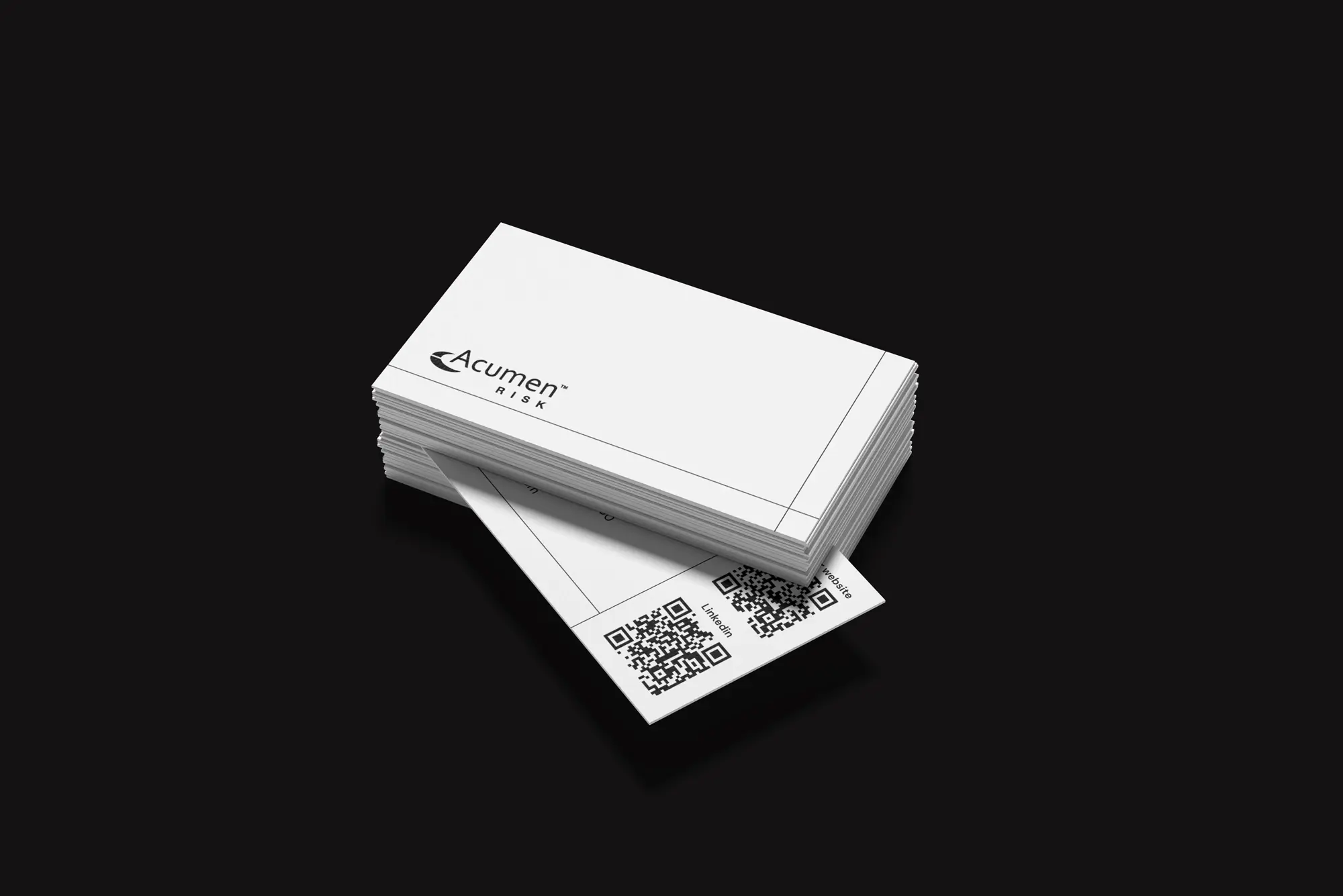
The business card design is minimalist, using only black ink on a white background. The design prioritizes clean lines, negative space, and a single, legible sans-serif font. Essential contact information is strategically placed, avoiding clutter. High-quality card stock enhances the professional impression. The result is a sophisticated and memorable card that communicates professionalism and modern sensibility through its simplicity and strategic use of contrast.
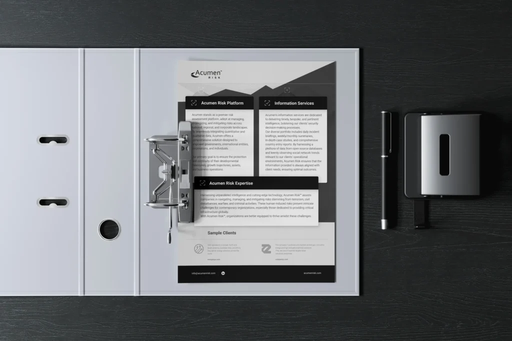
This capability statement design emphasizes clarity and professionalism through a clean, modern layout. The design employs a consistent brand identity, clear sectioning with descriptive headings, and a visual hierarchy using font sizes and bullet points. The overall impression is a polished, easy-to-read document that effectively communicates our client’s capabilities and expertise, leaving a positive impression on potential clients.
The final results were a visually coherent and flexible design materials that elevated our client’s communications, positioned their brand as contemporary and professional, and provided a framework they could use confidently moving forward.
By focusing on minimalism, clarity, and tonal balance, we delivered a design that was informative without distraction and felt as premium as the ideas they presented.
| Cookie | Duration | Description |
|---|---|---|
| __cf_bm | 1 hour | This cookie, set by Cloudflare, is used to support Cloudflare Bot Management. |
| __hssc | 1 hour | HubSpot sets this cookie to keep track of sessions and to determine if HubSpot should increment the session number and timestamps in the __hstc cookie. |
| __hssrc | session | This cookie is set by Hubspot whenever it changes the session cookie. The __hssrc cookie set to 1 indicates that the user has restarted the browser, and if the cookie does not exist, it is assumed to be a new session. |
| _cfuvid | session | Calendly sets this cookie to track users across sessions to optimize user experience by maintaining session consistency and providing personalized services |
| cookielawinfo-checkbox-advertisement | 1 year | Set by the GDPR Cookie Consent plugin, this cookie records the user consent for the cookies in the "Advertisement" category. |
| cookielawinfo-checkbox-analytics | 11 months | This cookie is set by GDPR Cookie Consent plugin. The cookie is used to store the user consent for the cookies in the category "Analytics". |
| cookielawinfo-checkbox-functional | 11 months | The cookie is set by GDPR cookie consent to record the user consent for the cookies in the category "Functional". |
| cookielawinfo-checkbox-necessary | 11 months | This cookie is set by GDPR Cookie Consent plugin. The cookies is used to store the user consent for the cookies in the category "Necessary". |
| cookielawinfo-checkbox-others | 11 months | This cookie is set by GDPR Cookie Consent plugin. The cookie is used to store the user consent for the cookies in the category "Other. |
| cookielawinfo-checkbox-performance | 11 months | This cookie is set by GDPR Cookie Consent plugin. The cookie is used to store the user consent for the cookies in the category "Performance". |
| CookieLawInfoConsent | 1 year | CookieYes sets this cookie to record the default button state of the corresponding category and the status of CCPA. It works only in coordination with the primary cookie. |
| elementor | never | The website's WordPress theme uses this cookie. It allows the website owner to implement or change the website's content in real-time. |
| viewed_cookie_policy | 11 months | The cookie is set by the GDPR Cookie Consent plugin and is used to store whether or not user has consented to the use of cookies. It does not store any personal data. |
| wpEmojiSettingsSupports | session | WordPress sets this cookie when a user interacts with emojis on a WordPress site. It helps determine if the user's browser can display emojis properly. |
| Cookie | Duration | Description |
|---|---|---|
| messagesUtk | 6 months | HubSpot sets this cookie to recognize visitors who chat via the chatflows tool. |
| ytidb::LAST_RESULT_ENTRY_KEY | never | The cookie ytidb::LAST_RESULT_ENTRY_KEY is used by YouTube to store the last search result entry that was clicked by the user. This information is used to improve the user experience by providing more relevant search results in the future. |
| Cookie | Duration | Description |
|---|---|---|
| __hstc | 6 months | Hubspot set this main cookie for tracking visitors. It contains the domain, initial timestamp (first visit), last timestamp (last visit), current timestamp (this visit), and session number (increments for each subsequent session). |
| hubspotutk | 6 months | HubSpot sets this cookie to keep track of the visitors to the website. This cookie is passed to HubSpot on form submission and used when deduplicating contacts. |
| Cookie | Duration | Description |
|---|---|---|
| VISITOR_INFO1_LIVE | 6 months | YouTube sets this cookie to measure bandwidth, determining whether the user gets the new or old player interface. |
| VISITOR_PRIVACY_METADATA | 6 months | YouTube sets this cookie to store the user's cookie consent state for the current domain. |
| YSC | session | Youtube sets this cookie to track the views of embedded videos on Youtube pages. |
| Cookie | Duration | Description |
|---|---|---|
| __Secure-ROLLOUT_TOKEN | 6 months | Description is currently not available. |
| _pk_id.189115.b69a | 1 year 1 month | Description is currently not available. |
| _pk_ses.189115.b69a | 1 hour | Description is currently not available. |
| _tcSessInfo | session | No description available. |
| cf_clearance | 1 year | Description is currently not available. |


Has a strong passion for typography and emerging technologies, skillfully combining artistic design with the latest digital innovations. His enthusiasm for modern tech trends is actively shaping projects with unique and innovative perspectives.


Introducing Bella, our recent graduate in graphic and web design!
She brings youthful energy and fresh ideas to our team, showcasing qualities that promise innovation and a bright future in the world of design.

With a keen eye for detail and an unmatched ability to enhance our projects, she’s the driving force behind our creative success.

Boris is a seasoned designer who effortlessly transforms ideas into captivating visuals, and swiftly grasping tasks, all while infusing each project with his remarkable ability to bring concepts to life.

With a remarkable eye for detail and a crisp style that elevates every project, Lora brings a fresh perspective and a perfect fit for our creative crew.
Her dedication to perfection matches her craft enthusiasm.

Bozhidar is a Graphic Designer whose creativity knows no bounds! He seamlessly blends his vivid imagination with contemporary
trends. Besides his flair for design, Bozhidar is a major tech buff, always keeping an eye out for the newest innovations and their potential influence on the creative landscape. Every project he undertakes is an exhilarating journey filled with enthusiasm. He approaches each challenge with an infectious smile and boundless passion.

Mimy’s been navigating the dynamic world of design for over ten years. Her artistic background has made her a true chameleon, adapting her talents to any design field she enters. Away from the screen, she is soaking into visual arts, swaying to musical beats, or diving into a sci-fi novel. We can feel these vibes in her work, and it’s inspiring! Mimy’s unique blend of creativity and neatness has made
her an invaluable asset to our team.

Val is our in house dynamo! Often referred to as ‘our bee’, she buzzes with creativity, dedicating herselfwholeheartedly to every project. With a special knack for crafts, she truly shines when it comes to video and animation, complemented by her flair for 3D. Always on the lookout for the next tech innovation, Val is perpetually
expanding her horizons. She’s the beacon that lights up our studio
with her infectious energy and positivity.

Maria boasts over 25 years of expertise, spanning design, marketing, and management. Beyond guiding the business and steering the creative team, she has a knack for narrating human experiences through the hues of the Pantone color chart. When it comes to innovative and out of the box concepts, Maria is our beacon. As our chief designer and creative guru, she’s immersed in the intricate details of design and the vibrant dance of colors. She’s not just about pixels and palettes though; nature beckons to her. With a fondness for outdoor escapades, she has a particular soft spot for bees tending to her beehives with as much dedication as she does her designs. Dog tales? They pull at her heartstrings!

Vasil is a seasoned and multifunctional designer with over 15 years under the belt, masterfully shaping both digital and print media. Vasil’s heart beats for nature. An avid traveler, he’s not just skimmed the surface but deeply explored the Amazon, immersing himself in the rich cultures and wonders. His journeys give hin unique perspective, which often shines through in his work. Whether in hte studio or trekking through rainforests, Vasil lives and breaths creativity and exploration.