
Defendara
Logo Design, Pitch Deck, Branded Materials
Maria Burgelova, Beloslava Ivanova, Val Petrova, Maria Yordanova
Defendara specializes in the security of power plants, providing cutting-edge technology to safeguard critical infrastructure from potential threats. Their mission is to ensure the resilience and protection of energy systems through advanced security measures.
The challenge was to create a modern tech brand that felt clean, professional, and easy to understand while not overshadowing the gravity of the subject matter. It was crucial to strike a balance between innovative design and the serious nature of power plant security. We needed to craft a visual identity that conveyed trust and competence without overwhelming the message. The branding had to support the narrative of digital defense, ensuring that the visual language aligned with Defendara’s commitment to clarity, reliability, and technological precision.
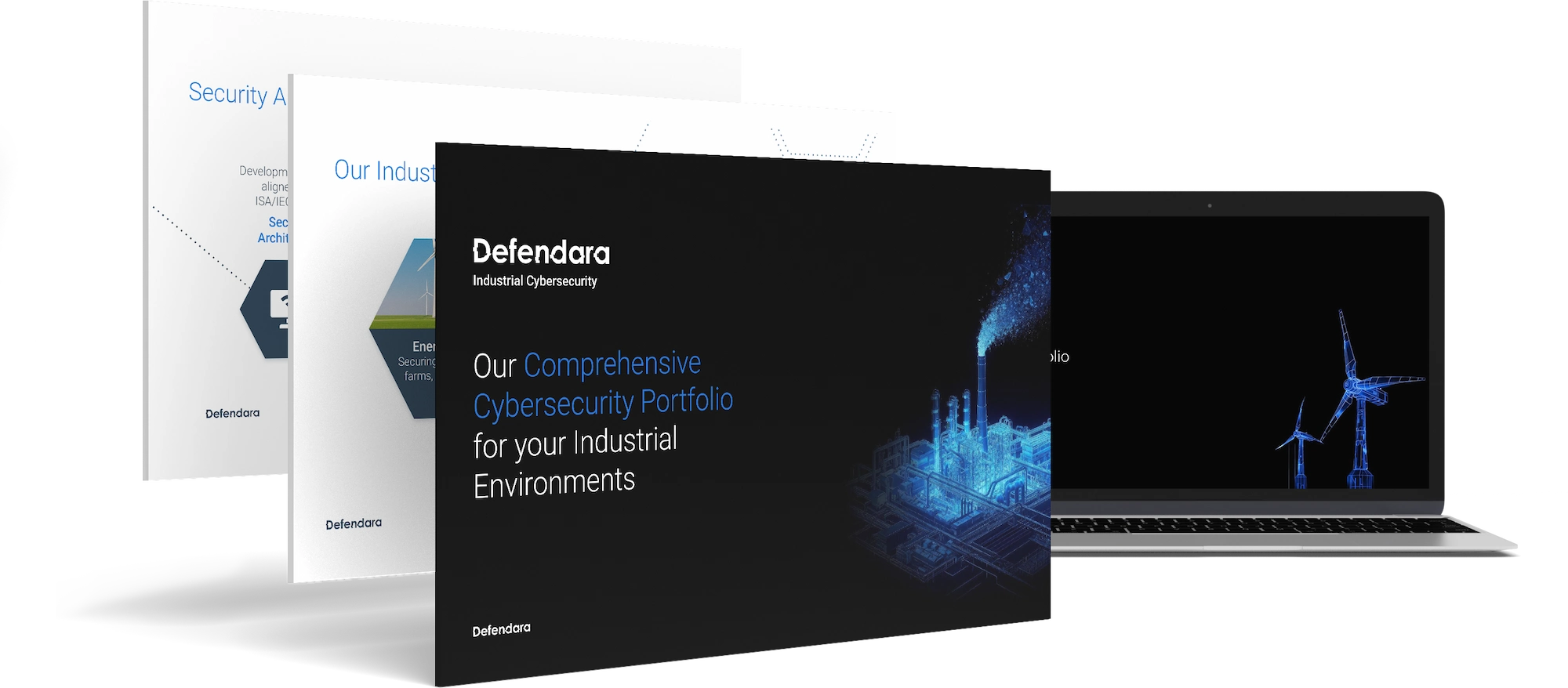
We leaned on a glitch effect for the logo to subtly represent the concept of digital security and vulnerability detection. Straight lines and easy-on-the-eye visuals conveyed a sense of order and precision. Visual storytelling played a key role in translating complex ideas into digestible narratives, ensuring clarity in communication. The glitch effect added a layer of modernity and technological sophistication, reinforcing the brand’s focus on digital infrastructure. The overall design seamlessly integrated the technical aspects of security with a sleek aesthetic, making the complex topic accessible and visually engaging.
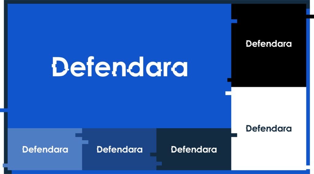
The logo integrates a glitch effect while maintaining simplicity. The clean white design ensures high contrast and readability across various applications, symbolizing clarity and reliability in Defendara’s mission. The glitch element subtly hints at digital protection, referencing the identification and correction of vulnerabilities in digital infrastructure. By keeping the logo simple and monochromatic, we ensured it remains versatile and recognizable, whether displayed on digital platforms, print materials, or signage.

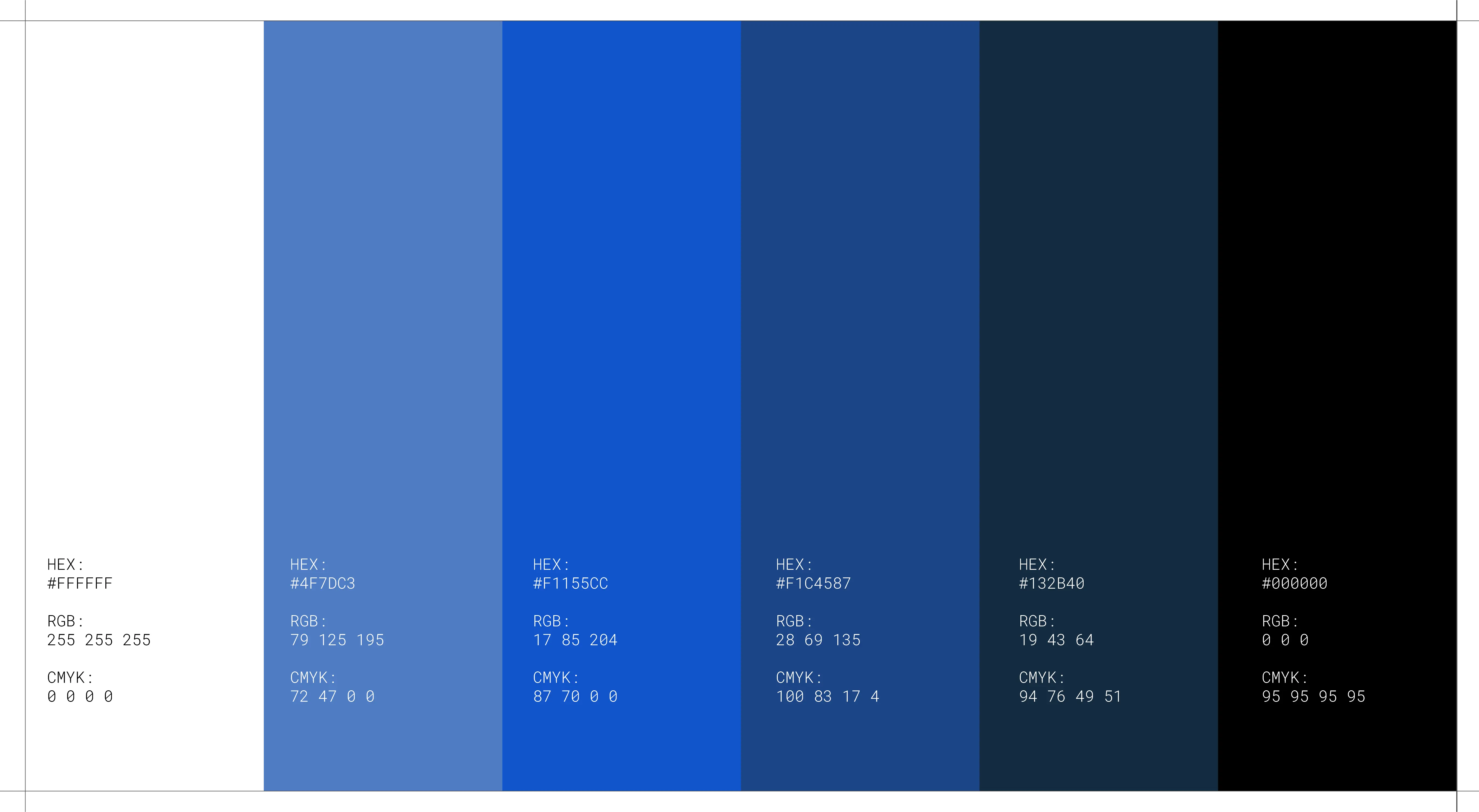
A minimal palette was chosen to maintain focus and clarity. Black and white formed the foundation, providing a timeless, authoritative look. Several shades of blue complemented this foundation, creating a sense of trust and technology while establishing visual hierarchy. The darker blues represented stability and security, while lighter shades added depth and variation, guiding the viewer’s attention to key information. This combination not only enhanced readability but also reinforced the brand’s modern and technical identity.
We selected the widely accessible Roboto font for its clean, sans-serif design. Different thicknesses were used to establish hierarchy, ensuring information is both clear and organized while maintaining a modern look. Roboto’s geometric form and legibility made it an ideal choice for conveying technical information without sacrificing readability. The varied font weights allowed us to create a natural flow in the content, drawing attention to headings and key messages while maintaining a cohesive visual structure throughout the brand.

Visual storytelling was implemented through dynamic imagery, depicting power plants transforming into wireframes in a sleek black and blue color scheme. This effect conveyed a “detailed map” concept, representing the thorough and precise security measures Defendara employs. The wireframe transformation symbolizes the process of digital analysis and protection, offering a glimpse into the meticulous mapping and safeguarding of these essential structures. The imagery serves as a bridge between the physical infrastructure and the digital defenses Defendara provides, enhancing the narrative of comprehensive security.
The Defendara brand successfully balances modern technology with the gravity of securing power plants. Through clean design, strategic use of color, and visual storytelling, the brand communicates trust, precision, and innovation in safeguarding critical infrastructure. Every design choice reflects Defendara’s core values of reliability and clarity, ensuring that the brand’s identity resonates with its audience. The result is a cohesive visual narrative that highlights Defendara’s expertise and dedication to protecting essential energy systems, presenting a brand that is both forward-thinking and grounded in responsibility.

| Cookie | Duration | Description |
|---|---|---|
| __cf_bm | 1 hour | This cookie, set by Cloudflare, is used to support Cloudflare Bot Management. |
| __hssc | 1 hour | HubSpot sets this cookie to keep track of sessions and to determine if HubSpot should increment the session number and timestamps in the __hstc cookie. |
| __hssrc | session | This cookie is set by Hubspot whenever it changes the session cookie. The __hssrc cookie set to 1 indicates that the user has restarted the browser, and if the cookie does not exist, it is assumed to be a new session. |
| _cfuvid | session | Calendly sets this cookie to track users across sessions to optimize user experience by maintaining session consistency and providing personalized services |
| cookielawinfo-checkbox-advertisement | 1 year | Set by the GDPR Cookie Consent plugin, this cookie records the user consent for the cookies in the "Advertisement" category. |
| cookielawinfo-checkbox-analytics | 11 months | This cookie is set by GDPR Cookie Consent plugin. The cookie is used to store the user consent for the cookies in the category "Analytics". |
| cookielawinfo-checkbox-functional | 11 months | The cookie is set by GDPR cookie consent to record the user consent for the cookies in the category "Functional". |
| cookielawinfo-checkbox-necessary | 11 months | This cookie is set by GDPR Cookie Consent plugin. The cookies is used to store the user consent for the cookies in the category "Necessary". |
| cookielawinfo-checkbox-others | 11 months | This cookie is set by GDPR Cookie Consent plugin. The cookie is used to store the user consent for the cookies in the category "Other. |
| cookielawinfo-checkbox-performance | 11 months | This cookie is set by GDPR Cookie Consent plugin. The cookie is used to store the user consent for the cookies in the category "Performance". |
| CookieLawInfoConsent | 1 year | CookieYes sets this cookie to record the default button state of the corresponding category and the status of CCPA. It works only in coordination with the primary cookie. |
| elementor | never | The website's WordPress theme uses this cookie. It allows the website owner to implement or change the website's content in real-time. |
| viewed_cookie_policy | 11 months | The cookie is set by the GDPR Cookie Consent plugin and is used to store whether or not user has consented to the use of cookies. It does not store any personal data. |
| wpEmojiSettingsSupports | session | WordPress sets this cookie when a user interacts with emojis on a WordPress site. It helps determine if the user's browser can display emojis properly. |
| Cookie | Duration | Description |
|---|---|---|
| messagesUtk | 6 months | HubSpot sets this cookie to recognize visitors who chat via the chatflows tool. |
| ytidb::LAST_RESULT_ENTRY_KEY | never | The cookie ytidb::LAST_RESULT_ENTRY_KEY is used by YouTube to store the last search result entry that was clicked by the user. This information is used to improve the user experience by providing more relevant search results in the future. |
| Cookie | Duration | Description |
|---|---|---|
| __hstc | 6 months | Hubspot set this main cookie for tracking visitors. It contains the domain, initial timestamp (first visit), last timestamp (last visit), current timestamp (this visit), and session number (increments for each subsequent session). |
| hubspotutk | 6 months | HubSpot sets this cookie to keep track of the visitors to the website. This cookie is passed to HubSpot on form submission and used when deduplicating contacts. |
| Cookie | Duration | Description |
|---|---|---|
| VISITOR_INFO1_LIVE | 6 months | YouTube sets this cookie to measure bandwidth, determining whether the user gets the new or old player interface. |
| VISITOR_PRIVACY_METADATA | 6 months | YouTube sets this cookie to store the user's cookie consent state for the current domain. |
| YSC | session | Youtube sets this cookie to track the views of embedded videos on Youtube pages. |
| Cookie | Duration | Description |
|---|---|---|
| __Secure-ROLLOUT_TOKEN | 6 months | Description is currently not available. |
| _pk_id.189115.b69a | 1 year 1 month | Description is currently not available. |
| _pk_ses.189115.b69a | 1 hour | Description is currently not available. |
| _tcSessInfo | session | No description available. |
| cf_clearance | 1 year | Description is currently not available. |


Has a strong passion for typography and emerging technologies, skillfully combining artistic design with the latest digital innovations. His enthusiasm for modern tech trends is actively shaping projects with unique and innovative perspectives.


Introducing Bella, our recent graduate in graphic and web design!
She brings youthful energy and fresh ideas to our team, showcasing qualities that promise innovation and a bright future in the world of design.

With a keen eye for detail and an unmatched ability to enhance our projects, she’s the driving force behind our creative success.

Boris is a seasoned designer who effortlessly transforms ideas into captivating visuals, and swiftly grasping tasks, all while infusing each project with his remarkable ability to bring concepts to life.

With a remarkable eye for detail and a crisp style that elevates every project, Lora brings a fresh perspective and a perfect fit for our creative crew.
Her dedication to perfection matches her craft enthusiasm.

Bozhidar is a Graphic Designer whose creativity knows no bounds! He seamlessly blends his vivid imagination with contemporary
trends. Besides his flair for design, Bozhidar is a major tech buff, always keeping an eye out for the newest innovations and their potential influence on the creative landscape. Every project he undertakes is an exhilarating journey filled with enthusiasm. He approaches each challenge with an infectious smile and boundless passion.

Mimy’s been navigating the dynamic world of design for over ten years. Her artistic background has made her a true chameleon, adapting her talents to any design field she enters. Away from the screen, she is soaking into visual arts, swaying to musical beats, or diving into a sci-fi novel. We can feel these vibes in her work, and it’s inspiring! Mimy’s unique blend of creativity and neatness has made
her an invaluable asset to our team.

Val is our in house dynamo! Often referred to as ‘our bee’, she buzzes with creativity, dedicating herselfwholeheartedly to every project. With a special knack for crafts, she truly shines when it comes to video and animation, complemented by her flair for 3D. Always on the lookout for the next tech innovation, Val is perpetually
expanding her horizons. She’s the beacon that lights up our studio
with her infectious energy and positivity.

Maria boasts over 25 years of expertise, spanning design, marketing, and management. Beyond guiding the business and steering the creative team, she has a knack for narrating human experiences through the hues of the Pantone color chart. When it comes to innovative and out of the box concepts, Maria is our beacon. As our chief designer and creative guru, she’s immersed in the intricate details of design and the vibrant dance of colors. She’s not just about pixels and palettes though; nature beckons to her. With a fondness for outdoor escapades, she has a particular soft spot for bees tending to her beehives with as much dedication as she does her designs. Dog tales? They pull at her heartstrings!

Vasil is a seasoned and multifunctional designer with over 15 years under the belt, masterfully shaping both digital and print media. Vasil’s heart beats for nature. An avid traveler, he’s not just skimmed the surface but deeply explored the Amazon, immersing himself in the rich cultures and wonders. His journeys give hin unique perspective, which often shines through in his work. Whether in hte studio or trekking through rainforests, Vasil lives and breaths creativity and exploration.