
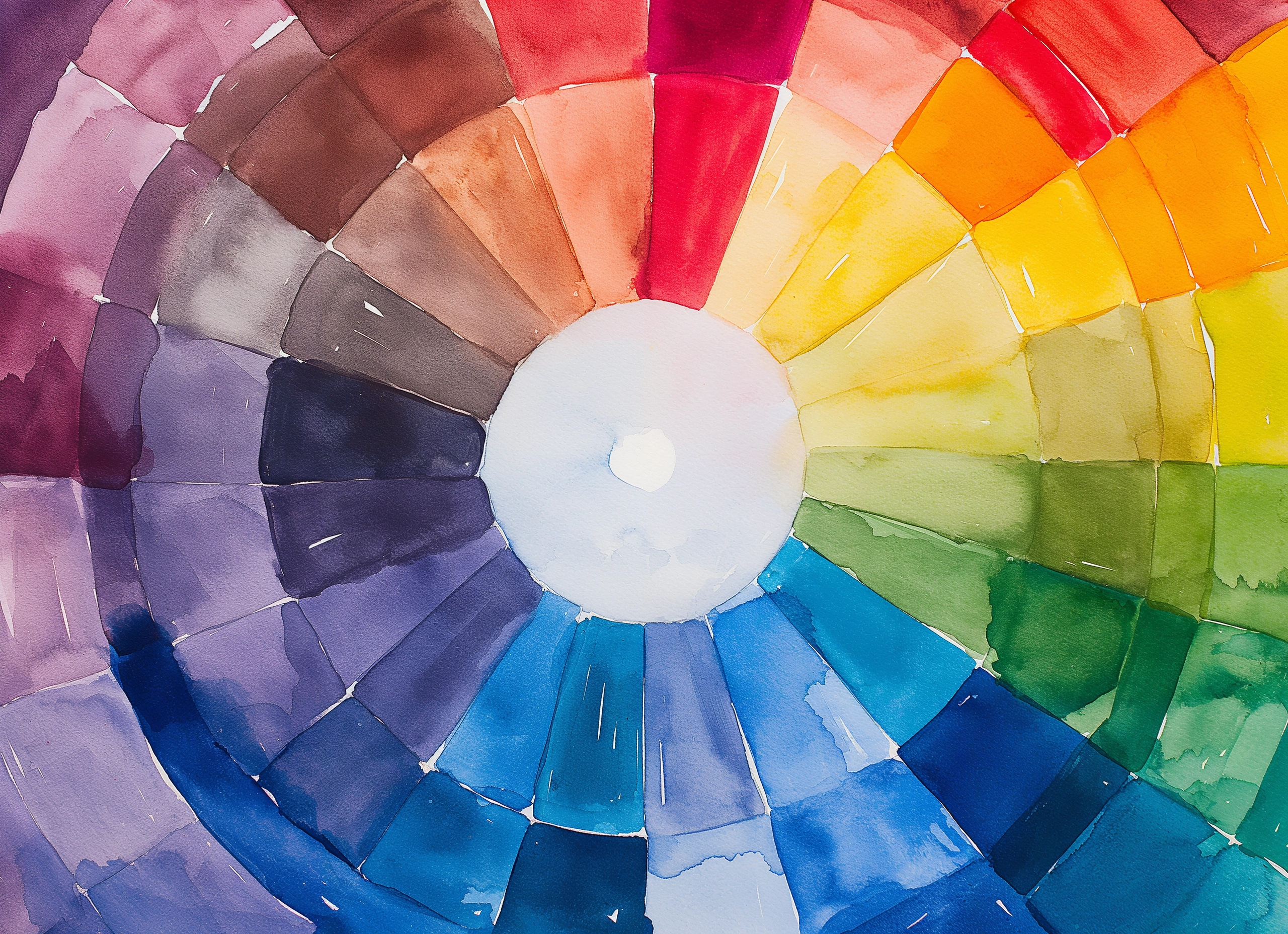
When we first see a design, color is the thing that attracts our attention. That is why it is necessary to generate a good and striking first impression. Color theory is the base for each and every designer and it helps to achieve an effective transmission of the message to the consumer.
Through psychological and behavioral studies, color theory is in charge of demonstrating that colors work to drive certain emotions. There is no single-color theory, however, it encompasses a set of basic rules that govern the mixing of colors to achieve desired effects, through the combination of colors, shades, shadows, or tones.
A brief history of color theory
The first clues we can find regarding the history of color theory are in the chromatic circle, designed by the mathematician Isaac Newton. Newton’s disk consists of a chromatic circle with sectors painted in red, orange, yellow, green, cyan, blue, and violet. This disk, rotating at high speed, combines the different colors and gives rise to the appearance of white.

The next theory of great relevance is the Goethe color theory, published in 1810. It contains some of the earliest and most accurate descriptions of colored shadows, refraction, and achromatism. The Goethe color theory talks about the beam of light and the beam of darkness on crystals and the different colors that are generated.
The Goethe color theory is one of the most outstanding. However, we can also find the discoveries of James Clerk Maxwell in the world of additive synthesis, or the theory of the chemist Wilhelm Ostwald about the four elementary chromatic sensations (yellow, red, blue, and green) and the two intermediate ones.

Color wheel
The color wheel is a key tool. It is a circular representation of all the colors of the visual spectrum, organized in such a way that opposite colors face each other and complementary colors are close to each other. The chromatic circle allows us to identify the primary or pure colors, and those that are considered derivatives, that is, the result of the mixing of colors.
Primary colors are those that cannot be obtained by mixing any other color and are blue, red, and yellow. A secondary color is created by the mixture of the primary colors. The combination of red and yellow creates orange; yellow and blue creates green; and blue and red, purple. On the other hand, tertiary colors are created by mixing secondary colors.

According to this type of color studies, different properties can be attributed to each one, such as:
Hue. Also named “chroma”, refers to color itself, which enables us to distinguish colors.
Luminosity. Also called “value”, it refers to the amount of light present in the color, that is, whether it is lighter or darker, which is equivalent to saying whether it is closer to black or white.
Saturation. Refers to the purity of the color, that is, the concentration of gray present in a color at a given time. The grayer it has, the less pure it will be and the lower its saturation will be, looking as if it were dirty, opaque.
Brightness: It is the light intensity of a color. It varies depending on how close the color is to white or black.
Color harmony
Color harmony refers to the organization of colors in an orderly and pleasing manner. When colors are arranged or organized in the right way, viewers feel a sense of visual calm or peace. Conversely, when there is a lack of color harmony, the design evokes a sense of chaos and rejection. To organize colors effectively, it is essential to understand how the different color schemes work.
Monochrome
Monochromatic color schemes are established on a unique color with different tones and shades. It is easier to create a harmonious design when working with a monochromatic color palette because of its limited color options.

Analogous colors
With the analogous formula, colors are chosen that follow each other on the color wheel, such as reds and oranges, or blues and greens. When using an analogous color palette, designers must beware of a lack of contrast in their designs. To add contrast, it is best to choose a color that is compatible with the overall color scheme of the design.

Complementary colors
Complementary shades are found on the other side of the color wheel. These high-contrast combinations create a striking look but should be handled with care. They are preferably applied in shorter areas of the design, especially where the purposeful effect is to emphasize one feature of the design.
Color triad
With the triad, a triangle is formed in the chromatic circle and the colors at each corner are used. This palette opens the possibility of using more colors in the design and can be useful when the project requires more than two colors. To create a harmonious design, it is always useful to work on color balance. It is recommended to use one dominant color and the other two colors to accent some detail.
Complementary Split
Complementary Split color harmony is a type of color scheme that involves using two complementary colors, which are colors that are opposite each other on the color wheel, and a third color located between them. The complementary split scheme creates a vibrant and eye-catching color combination that is well-balanced and harmonious. By using a third color between the two complementary colors, the scheme is split into warmer and cooler tones, which helps to provide contrast and visual interest.
Double Complementary
This color scheme is for more experienced designers. The colors when connected form a rectangle within the color wheel. The color balance must be perfect to carry out this scheme in a design. It is difficult to harmonize this design, but when done well it can be beautiful.

Color models
The RGB color model
It is so named because of its primary colors: red, green, and blue, from which the rest is composed. It is an additive color system.
The additive color system is based on the principle of light, where color is created by adding different wavelengths of light together. This system is commonly used in electronic displays such as televisions, computer monitors, and projectors. The primary colors in the additive system are red, green, and blue (RGB), and all other colors are created by mixing these three colors in various intensities. As more light is added, the colors become brighter, and eventually, white light is produced. The exceptions are black, which is produced in the absence of light (and therefore color), and white, which is produced in the presence of all colors, recomposing the spectrum.
The CMYK color model
The CMYK model is the union of the initials of the colors it takes as reference: cyan, magenta, yellow, and with the addition of black called Key to avoid confusion with the B of the blue of the RGB. When all three colors are mixed together in equal amounts, they subtract all wavelengths of light and produce black.
Cyan, magenta, and yellow pigments are mixed together to create a range of colors, with black ink added to improve contrast and definition. The Key (black) component is important in printing because it allows for the creation of dark tones and text that are sharp and easy to read. By using the CMYK color model, printers are able to accurately reproduce a wide range of colors, including gradients and fine details, in printed materials such as books, brochures, and posters.
The CMYK model understands the color from the absorption of light so that, unlike the RGB, it is of subtractive type. The subtractive color system is based on the principle of absorption, where color is created by subtracting certain wavelengths of light from white light. This color model is used in various ink printing techniques since most of the physical media lacks the luminous properties of monitors or projectors – such as paints, inks, and dyes.

The important thing is to consider what factors subconsciously and consciously influence the consumption habits of each potential customer. Color is subjective and emotional and is often the most delicate element of a project. When starting a corporate image design, it is vital to pay attention to the psychology of color.
90% of design is persuasion: the client does not respond to it because it is beautiful, but because it is right.