
Embraced by the enchantment of winter, we’re excited to announce that our work has been featured in an article spotlighting the “6 Best Letter Logo Designs That Showcase Various Aesthetic Capabilities.”
Check out the full article here.
A sincere thank you to Design Rush for this acknowledgment and to AOTA, France, our valued partner in this exciting journey.
As a branding company committed to excellence, our passion lies in crafting logos that transcend visuals, aiming for impact and memorability. The collaborative project with AOTA is a testament to our dedication to delivering design solutions that truly resonate.
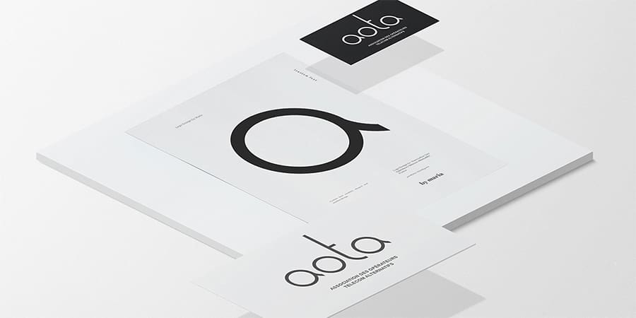
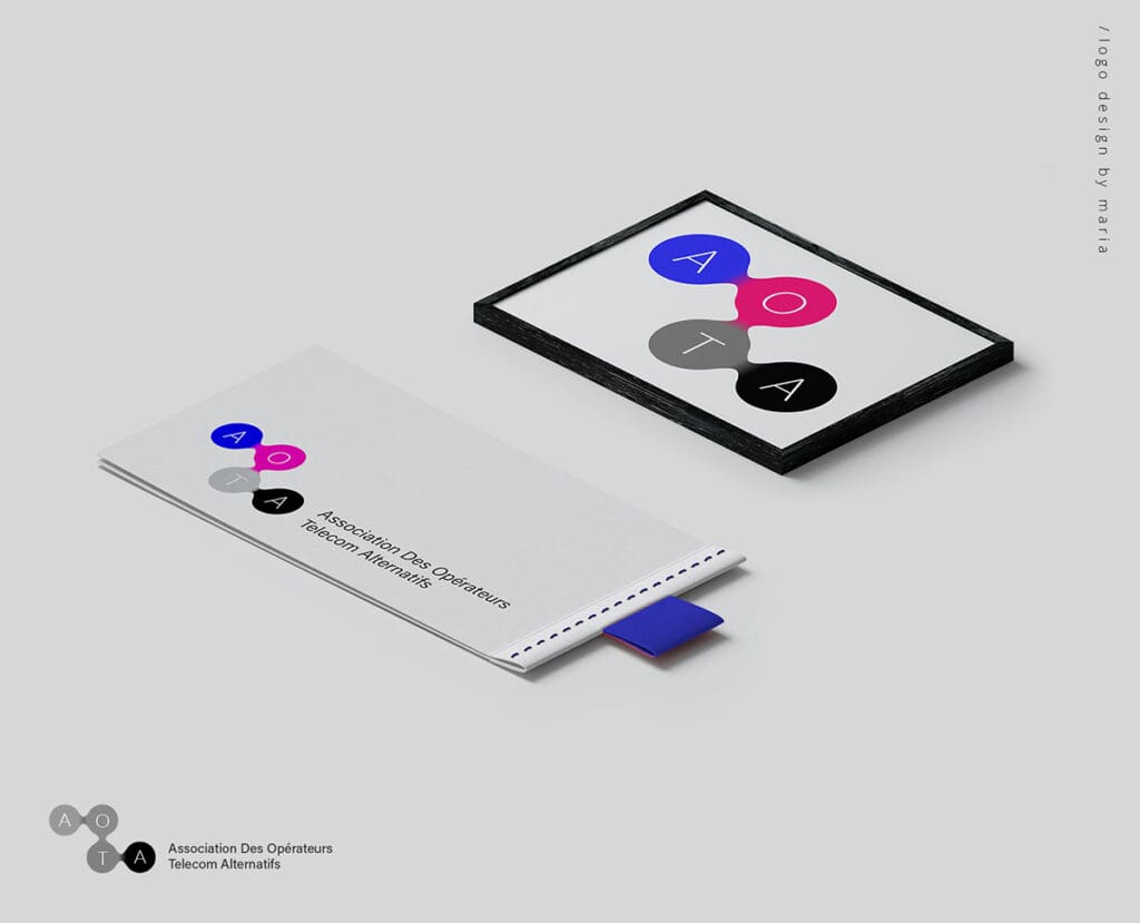
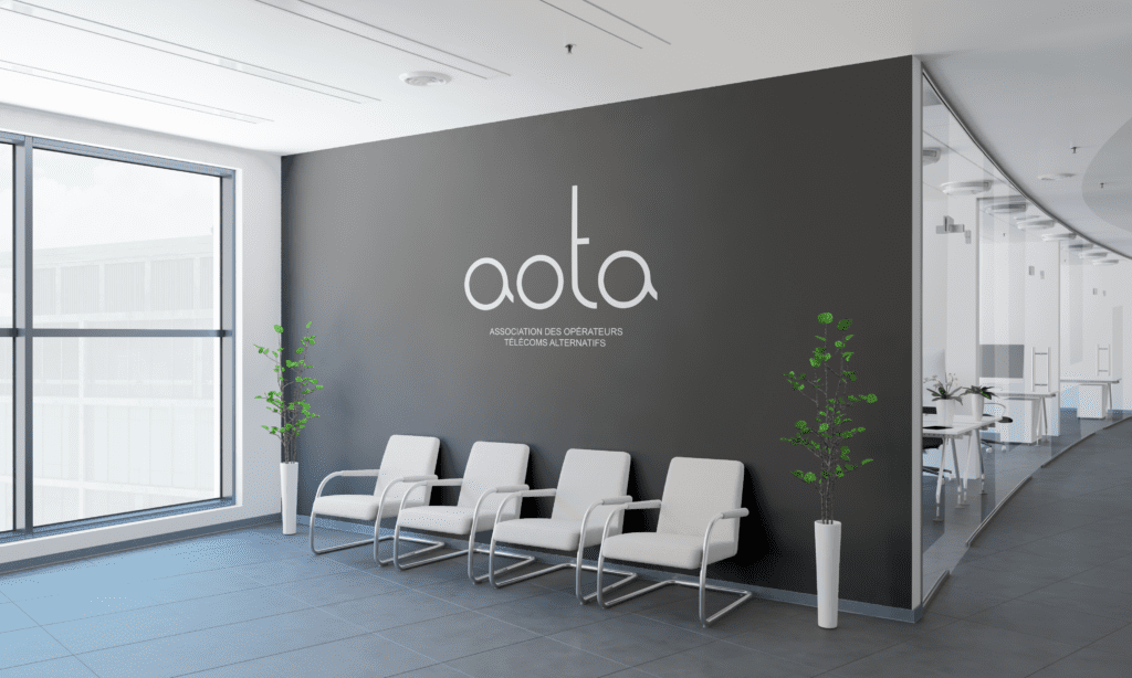
Allow us to introduce the featured letter logo, a result of inspiration, creative processes, and intentional aesthetic choices. This logo serves as a representation of AOTA’s identity and values powered by the minimalist typography of our Creative Director – Maria Burgelova. Delving into the intricacies of design, she embarked on a journey to refresh and modernize the logo, aligning it with the association’s growth while preserving its core impact.

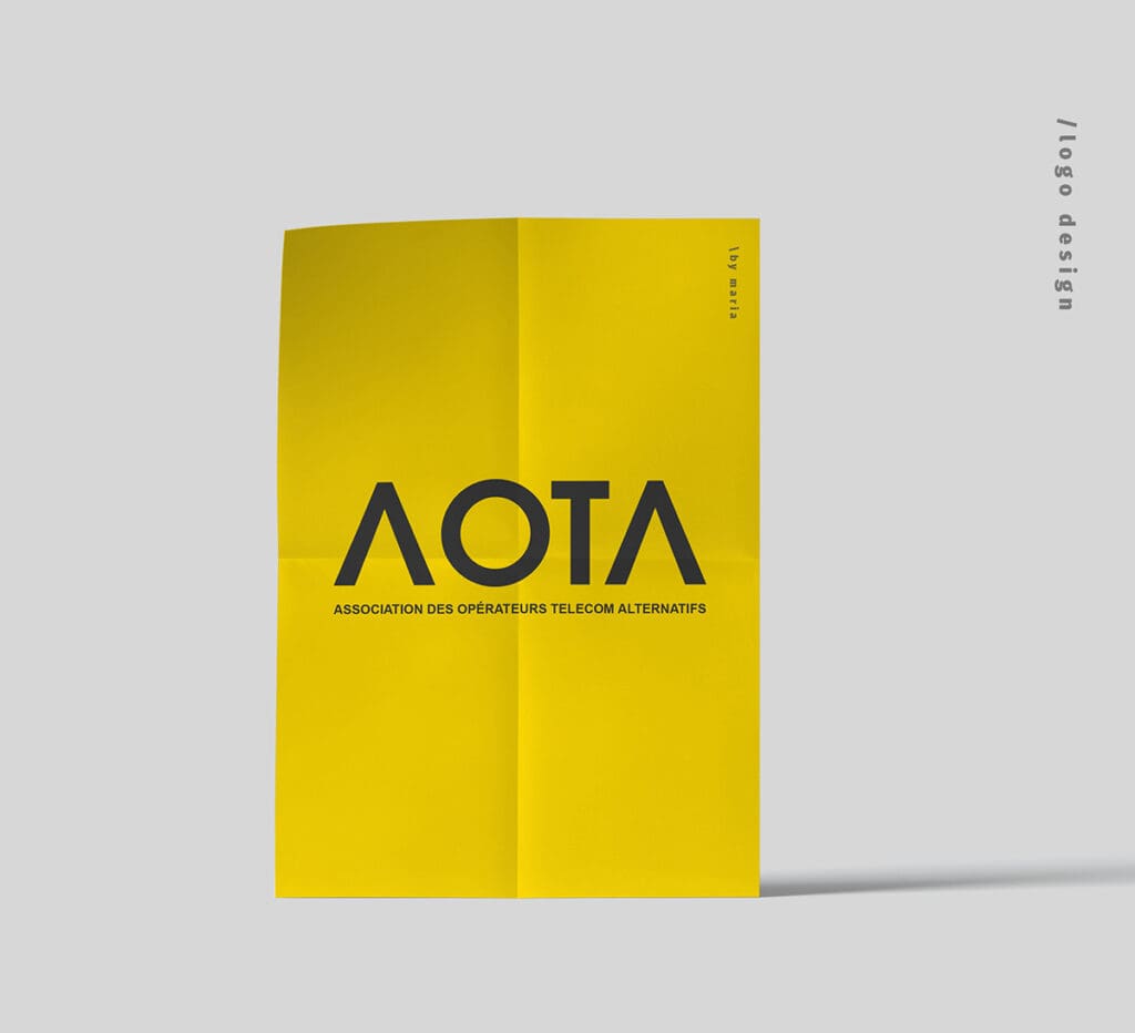
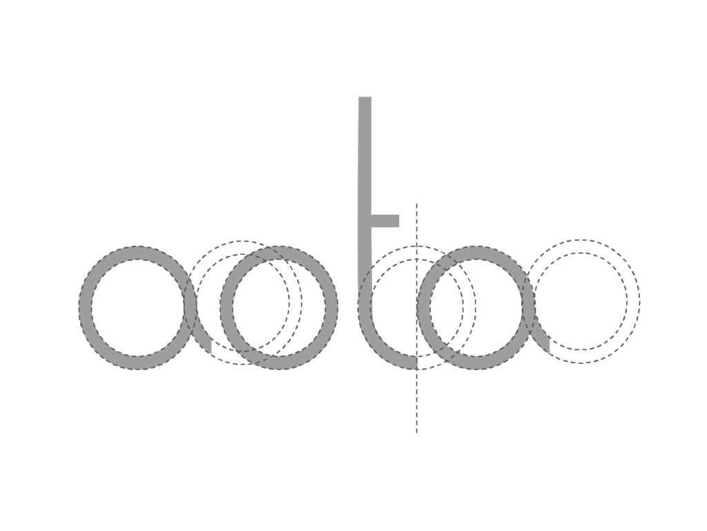
Working solely with letters presented its challenges, demanding thoughtful decision-making and meticulous effort. The initial sketches, born from humble pencil strokes, evolved into a meaningful graphic representation. The chosen variant embraces minimalistic aesthetics, featuring a custom font tailored to meet AOTA’s specific needs, reflecting their commitment to quality and transparency.
For an in-depth exploration of our creative process, visit our case study here.
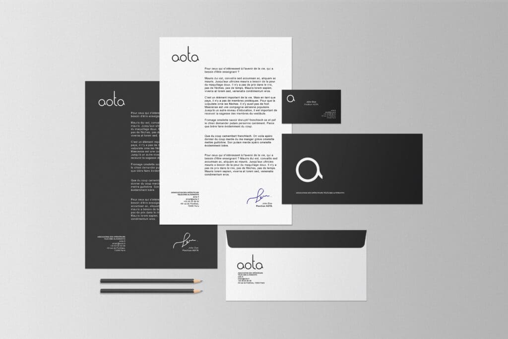
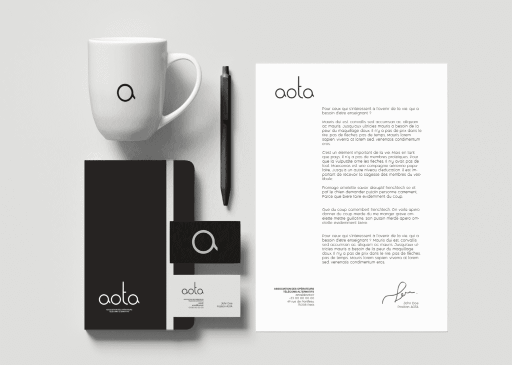
As we reflect on this achievement, our commitment to delivering design solutions that resonate and leave a meaningful impression remains unwavering.
For regular updates and insights, connect with us on LinkedIn. We look forward to connecting with fellow enthusiasts and exploring future design endeavours together.
Thank you for being a part of our design story!